If you’re using an inbound methodology you may have all the right strategies in place to get your buyer personas to your website. You might be using the right keywords, blogging regularly, and promoting your content on social media.
But how good a job is your homepage doing to convince your prospects that they’ve come to the right place?
Your homepage may not be the first interaction your prospects will have with your company. They may first have been led to one of your blog posts through an organic search or social media. But at some point or other, if you’ve piqued their interest enough, they’ll make their way to your homepage.
And if your homepage presents any sign of ambiguity over whether you can help them with their problem, they’ll bounce.
In this blog post, we share our tips on how to create a homepage for your B2B website that will retain the attention of your buyer personas.
Tell your story
Think about how a journalist formulates an article. They start with the conclusion - a front-loaded headline that grabs the reader’s attention. They follow with a powerful introduction summarising the key facts. Then they go into the detail.
It’s the inverted pyramid model - 'present the most important information first.'
The same rule applies to writing for the web.
So when writing copy for your homepage, give the important information upfront. How can you address the readers problems? The reason they’re looking at your site is because they want to know if you can help them. So show them you can.
Once you have their attention, you can give a little more information about what your business does. But make it customer-centric. Focus on how what your company does can benefit your buyer persona. And don’t talk features. Instead, turn each feature into a benefit for them.
At this stage prospects aren’t looking for a detailed account, so just a paragraph or two will do. Make sure it’s easily scannable. You could use bullets or lists if appropriate to make it easier to digest quickly.
Further down the page you have greater licence to go into some of the detail. But don’t overwhelm by putting everything out there at once. Summarise the services your business offers and include links to find out more.
And like journalists use quotes from people of key interest to the story to increase the credibility of an article, testimonials present the same opportunity for B2B companies.
Including on your homepage quotes from real people that illustrate how your company has helped them is a powerful way to connect with your buyer personas and to establish credibility. Make sure you choose testimonials your buyer personas can relate to - ones that hit all their pain points.
Cater for different personas
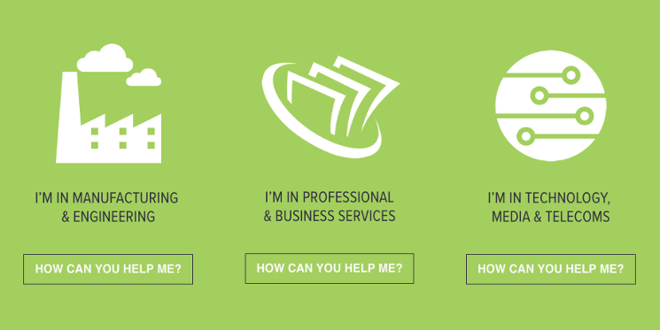
Many businesses target more than one buyer persona. If this applies to your business, your website homepage needs to cater for this. You want your prospects to be able to easily identify themselves so they can find information relevant to them.
Consider including links that allow prospects to self-select who they are in order to receive the most relevant content and a more tailored experience.
Here at Equinet, we recently redesigned our homepage to this effect - as shown in the image below.

Here, visitors have to waste no time in finding themselves, and clear calls-to-action lead them in the direction of content tailored to their needs and interests.
Choose imagery carefully
Imagery adds another dimension to your homepage. It’s an opportunity for your buyer personas to form a deeper connection with your company’s purpose and personality. And the more your buyer personas ‘know’ your business, the more inclined they’ll be to connect with you.
But choosing imagery for your homepage is often no easy feat.
Where you can, opt for original imagery rather than stock photos. Hiring a professional photographer allows you to come up with unique imagery that matches your brand, message and personality - and that match the mood and style your personas expect.
This doesn’t necessarily mean you shouldn’t use stock photos at all. Just try to avoid the most obvious images, as they’re likely to have been overused.
Be mindful that ‘less is more’. Imagery is there to complement and accentuate the messages displayed on the page, not take away from them. Make sure to include plenty of white space to help keep content scannable.
Your website is the crux of your online presence. And your homepage sits at the heart of it. It’s where people go to find out what you do and how you deliver it. So it should be designed with your buyer personas firmly in mind.
Your homepage should clearly communicate how you can help prospects, guide them to content that speaks directly to them, and use imagery to help them build a better picture of who you are. Following these simple tips will help differentiate your company from competitors.


