Pictures are a must in any blog post these days as they attract the reader, get shared on social media and help with SEO. But too many blogs feature posts in the headline/picture/text format, with no great variation in any of these elements. Lots of posts have been written on the text in a blog, and maybe even more on the importance of the headline, but what can we do with the pictures?
It has always struck me as strange that the one thing that can be varied - can be changed; can be played with - is the image in a post, and yet so many content creators settle for a standard layout and a standard rectangular shape.
So here are some other ideas for bringing your blog to life with images.
One big pic
Using one large image is always a great way to attract the eye. If a picture is really good, really has impact and really tells the story you want to tell without words, then feature it large and let the image be the message. This is a surefire way to create an impact.
White Space

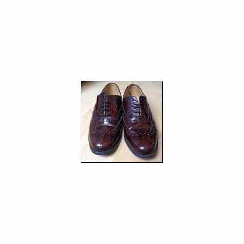
Placing a small image in an ocean of white space also creates a strong visual impact - suggesting the image is important. It can also emphasise the isolation of the subject of the image.
Multiple images

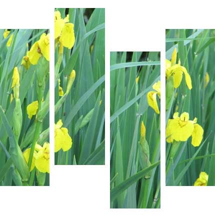
Using multiple images cropped in unusual ways can be visually attractive and quite dramatic. So why not create a cropped set of images as vertical strips, or perhaps place them horizontally like blinds.
Another variation is to take the same image and break it into strips.

Thin strip

One thin strip is a very dramatic way to use an image.
Background image

Cut-outs
 Removing the background from an image to create a cut-out makes for a more dynamic, interesting shape - the outline becomes irregular and captures the eye. Add a subtle drop shadow for effect and you have a 3D feature that further attracts the eye. If you can run text around the cut-out image, then this breaks up the text and makes it less boring on the eye.
Colour focus

In some ways similar to a cut-out, another way to focus attention on a subject is to desaturate the colour in the background so it goes to black and white, while retaining full colour on the subject.
This works particularly well on historical subjects.
Bleed
Depending on your blog set-up and your content management system’s capabilities, bleeding an image - where the picture goes off the "page" - is another great visual effect. Of course, most websites don’t have a "page" as such, but breaking out of the column and spreading into the margin creates a similar feel.
Angles
Placing a picture at an angle will catch the eye and is another great way to create an element of dynamism in the flow of your page. If you are doing a diary or featuring people’s photos of an event, then placing the images at an angle makes them feel like snapshots that have just been placed on the page. If you add a thick white or off-white border to the images - like photographic prints - it adds to this feel.
As a border

Why not use lots of small images to create a border? This is great when you have low resolution images, as they look better small. Lots of small images can also be very effective in attracting the reader’s eye.
Using a small image between each section of your article is another great way to lighten long passages of text.
Comparisons
Having before and after images can be very powerful for product or service demonstrations - the traditional way to show a comparison is to use two identically sized pictures side by side. In these images the comparison is between two different styles of conference room layout.
Inset image

If you have more than one image or want to show a detail, why not use an inset image on top of the main image?
This can also be a clever way of covering up a part of the main image you don’t really want seen.
Montage

Montages consisting of multiple images either overlaid - or as here, arranged in an interesting way - will always engage the reader's interest and are great if you have lots of photos.
Using images
There is no excuse - other than laziness - not to spend as much time thinking about how you are going to use your image (or images) to enhance and support the message of your blog post as you do creating your headline or composing your text. Look at your image(s) - what do they suggest? How good are they? How can they be used to emphasise the message? How can you use them creatively?
With just a little bit of thought and a little bit of time, your images can become your most powerful way to attract readers, to give your posts a unique look and to add a little design magic to your blog.


